Potfest in the Park
- Jul 31, 2024
- 7 min read
26th - 28th July 2024. Hutton In The Forest, Cumbria, CA11 9TH
I visited the original Potfest In The Park back in 2001. I'd been going to The Pens for several years, when visiting my parents who lived just outside Penrith. My mother had volunteered as a tour guide in the stately homes since they moved up in 1989, so when the new flagship event, in nice open-air surroundings took place it was so exciting. Up until this time the only major fair, that showcased national and international makers, was at Hatfield, which I visited most years.
The Park remains one of Potfests' 2 flagship events, together with the newer Potfest by the Lake at Compton Verney. Definitely ones to aspire to be part of, together with Ceramic Art London.
I had a wonderful day, despite the weather. Many many thanks to Sharon Griffin and Christy Keeney for tremendous conversations, that were so friendly, helpful and affirming. I not only love the work of these two tremendous potters, but they are so open and supportive I'm quite blown away.
And it was lovely to have a good chat with Geoff Cox, talking about the great workshop that was linked to Potfest in the Park back in 2004(?) at Upfront Gallery. I think I'll have to dig out my photos and write a blog about that in due course.
I've commented on many of the ceramicists on other pages, about other Potfests and exhibitions, so for this one I'm going to limit myself to comments about the stalls themselves, the competition and what I bought.
List of all participants in Potfest in the Park, 2024.
Presentation of work - set up of stalls
A part of the UCLAN MA Ceramics course is to encourage the participation in exhibitions and events like Potfest.
So what a good opportunity to see how well established and recognised potters present their work. The covering of stalls, stands used, the grouping of work, leaflets/information and even how the prices of work is displayed and where the makers sit - so many things to consider. I'm sure this is something I will come back to ........
There were a few pretty basic stalls, making little use of stands or backdrops. In the couple of instances highlighted here, the work was fantastic, but got lost into an unsympathetic background.

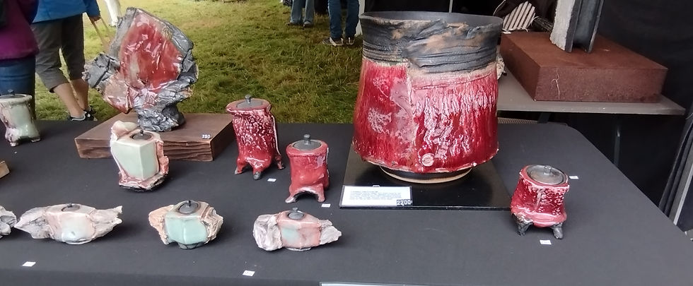
The top stall also has no backdrop and the work is not grouped in such a way as to emphasis the colour, size nor even price of the pieces. The lower stall has some grouping, but I found the layout without a clear cohesion. It struck me that both had more of a craft market stall than a presentation of the extremely desirable ceramic art that it was.
There were a number of stall that really did present as mini galleries, with the work well grouped, the makers/studio well signed and the backdrops and stands pertinent to the work on show to potential customers (and incidental window shoppers).

Craig Underhills show of exquisite work was really well grouped by theme and colour, the use of glass shelving was appropriate and highlighted specific works. The board backdrop set back from the tables was clear, unfussy and gave the maker a nicely retired position to talk about and sell work. Basically it looked really professional.

Robert and Debbie from Cellar Ceramics had a beautifully clear, concise well themed set-up, even down to the mugs on cup holders on one wall. I was particularly struck by the cup-wall that formed the outer boarder of their corner plot. The delicate designs and crisp decoration were given space to breath. And all this planned in really short time, as Robert said they had not got confirmation they were participating until the beginning of that week. The only point I would make was that the seller had no place to go to give potential customers the space to look without pressure
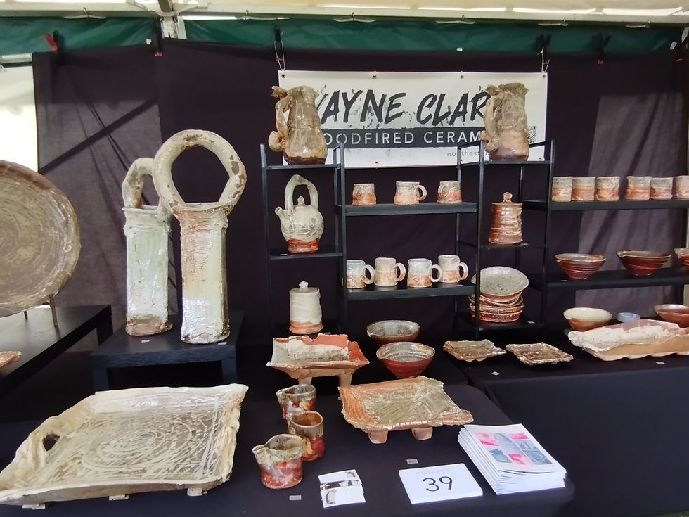
Wayne Clarks stall was bold and really distinctive. If you were 'having a look first' before going back to buy there was no chance of going to the wrong stall by mistake. Given the range of the work from VERY BIG to rather small, and that there were distinct series of works the grouping and set up could have really detracted. But tight grouping of mugs, bowls etc on shelves and the prominence given to the big Ank-like forms and platters gave everything its place. The use of printed banners is good for personal I.D. and description, but looks much less professional than a printed on board backdrop.

Rob Parrs stall was very well considered, with tight grouping, groups appropriately elevated, a very neat hardboard backdrop and very nice Perspex name and information plate. Even the black table cover was tidy. The only thing I was left wondering was, if it were not a corner plot where he would have positioned himself to be on hand whilst also inconspicuous?
A few stalls had features that I really liked. Alvinn Irvings wall of mugs, with a few spaces left empty "so it looks like some have already been bought", Toon Thijs reflective surfaces on stands to emphasis the form and decoration at the bottom of precise and very formal work, Simone Krug-Springsguths addition of a poster giving a nice personal touch about the philosophy of the work in an accessible way, Simon Olleys sketchbook sympathetically displayed.


There were two stand-out stalls regarding presentation and accessibility.
Without a doubt in my mind the most striking, in terms of content, presentation and professionalism was that of Felicity Lloyd-Combes. Each piece had its place on carefully curated stands. The hardboard backdrop was clear, unfussy and very informative. I happened to be walking by as she was packing up a sold piece, in a very secure container which included leaflets about her work and courses.

The stall-hold prize would, however, go to Joseph Morgan and his Robots. There were problems with it - notably that the lovely little figures on the back board could not be reached, particularly by the vertically challenged! The presentation was not as professional as Felicity Lloyd-Combes, but the colour and joyfulness in the layout and work was inspiring. I think it was even more colourful than Ben Foskers pink back-drops and eye-catching work.


There seems to be a growing trend of not displaying prices, or putting them behind work. I can understand the reasoning, but as a potential buyer I find this a real put-of.
The Competition
The theme of the competition was Hybrids. As always it was a mixed bag, some potters didn't participate at all, some just put in a sample of their normal work that seemed to have no bearing on the theme, some really threw themselves into it and came up with really interesting work and concepts - and at least one potter either forgot to bring the pot or had sold it and all that was left was a tasteful stack of display boxes.
The piece that seemed to draw the most attention was Simon Griffiths "Potfest gives you wings". At times there was a queue of people waiting to be photographed in front of the expansive ceramic Angel wings on a rough wooden totem. As with so many things I was just too short - it was more like 'diminutive viking with extra large feathers in my helmet'. Unfortunately I didn't get a picture of the work.
Apart from this show-stopper there was a really eclectic spread of work - from Janene Waudbys take on environment pollution creating hybrids (and monsters), through Richard Heeleys 'Snake vs Fridge' to Jon Barrett-Danes sublime 'Nimbus'.

Janene Waudby

Richard Heeley

Jon Barrett-Danes
So - those I voted for were:-
1st place Russell Kingston 'Bowls with handles'. I was absolutely transfixed by the cleverness of these three pieces. The way each has a specific domestic functionality - jug, bowl, trinket box - and yet is so weirdly encompassed in what looks like a completely dysfunctional vase. And the skill involved in the build is very impressive

My second choice was Paul Smiths collaborations that he did with Sharon Griffin 'a self portrait bust?' and Ben Fosker 'a tiger on a plinth'. It takes a lot of courage to be an established potter with a strong personal brand and following, and then go and make work at a course run by someone else, and then publish it. As the title of the work says 'Every Day is a School Day'. The hybrid tiger - between the styles of Smith and Fosker, is intriguing in its completely different energy to the normal work of Smith and the free-flow naivism of Fosker.


My third choice was Daniel Boyle 'KAA' - very witty and quite understatedly deceiving.

What I bought
I came away with 3 pieces that really caught my eye - 2 functional and 1 sculptural.
The eye-catching work of Simon Shaw caught my eye again. His stall was just across from the UCLAN one at Ceramic Art Wales, and although I did not think I was a fan of matt blue glazes I do believe his work has converted me. I bought this 12 inch high piece - it has real flow and energy, and the addition of dull gold paint appeals to me and really sets it off. Will probably change the base though ...........


After waiting for years for our utilatarian crockery to bite the dust, we've given up and decided to just replace all our daily eating bowls with ones we love, that have skill and individuality. Our latest bowl fest is from Mike Parry - who specialises in slipware. In addition to excellent work in the native tradition I really liked the way he presented his stall. But it was a beautifully understated breakfast bowl that took my fancy. I'm sure my muesli tastes better in it :-

And finally:- the quality of the throwing and the finesse of the hand painted decorations on the work of Cellar Ceramics - Robert Rivett and Debbie Fieldhouse - meant that the drinking cup I got was just calling out for some wine. It had to be. I think we will all be seeing a lot more of this lovely couple in the future.


31st July 2024


Comments